Monday, May 5, 2014

Fire Truck Response Times


The poster below compares fire truck response times in my hometown, Pembroke Massachusetts, under two scenarios. Scenario 1 assumes that all four of the town's fire stations are active. Scenario 2 assumes that the North Pembroke Station is closed due to town budget reasons and shows the difference in response times when compared to scenario 1. This has been an actual debate in the Town of Pembroke as the North Pembroke station is currently not staffed. Due to the industrialized nature of North Pembroke there has been concern that fire truck response time would be too long for the area in the event of a major fire at one of the commercial facilities. From the comparison, we can see that having the North Pembroke station open does improve the response time for the industrial areas down to the national standard of 5 minutes. There is, however, much overlapping in the southern portion of its service areas making it redundant in that area. All things considered for maximum safety, it would be an important asset to the town.


Friday, May 2, 2014

Distance Analysis for Massachusetts Community Colleges

The poster below compares two methods of visualizing distance using ArcMap, Network Analysis, and the Euclidean Distance Tool. Network Analysis uses established road networks to determine a driving distance from a set location, which was Massachusetts Community Colleges in this case. Euclidean Distance, could be considered "as the crow flies," and does not take road networks into account. As far as visual appeal and usefulness goes, it appears that Network Analysis provides the superior output. Because it takes road travel into account, it would be more useful to determine distances students or faculty would need to travel to get to individual community colleges in Massachusetts.


Thursday, May 1, 2014

My GPS Map

Below is a map demonstrating the use of a GPS to geospatially track a route. This map shows route 14 which was the subject of field testing for my undergraduate research project. My goal was to track the change in air temperatures and relate it to the location's distance from the coast. However, because of the lack of a way to correspond temperature readings taken along with location, I used this method to approximate distances along the route. Each point, for runs 5 and 6 was taken at 1 minute intervals along the route travelling east and the pins represent the approximate distance between the two runs. This gave me an average location on the route allowing me to relate temperatures taken at a given location.
View Larger Map

Wednesday, April 16, 2014

Geocoding Community Colleges

 
Like geographic coordinates, geocoding is a method to plot points on a map. However, instead of using latitude and longitude, geocoding uses street addresses, states/provinces, and zip codes to find locations. It is not as versatile as using geographic coordinates because every country has a different geocoding method, but it is widely used, especially in online applications like Google Maps.
 
For this brief assignment, I collected addresses of Massachusetts community colleges and geocoded their locations on a map. For the purposes of analysis, I also included population densities of Massachusetts towns and major highways. Based on the analysis it appears as though every community college is located in a town with a population density greater than that of surrounding towns. They are also located close to major highways making them very accessable. Considering that they all sit within towns that have high population densities, it appears that Massachusetts Community Colleges has done a good job planning locations that best serve the most people.


Wednesday, March 26, 2014

A Search for Potential Locations of a Solar-Wind Farm

For this exercise we created a scenario where two Plymouth County towns were collaborating to identify suitable areas for a combined solar and wind farm using raster data. Displayed on the poster below are locations in Kingston and Pembroke which meet the set criteria of having topography with less than a 15 degree slope and are at a southerly aspect between 135 and 225 degrees. The areas which meet the topography criteria must also be in a zone with an average wind speed greater than 5 m/s at 30 m. This analysis was accomplished using Esri's GIS software and datalayers provided by Massachusetts GIS. Locations were identified through utilizing tools such as slope and aspect in ArcGIS to manipulate a digital elevation model of Massachusetts. Using the DEM, it was possible to map the terrain's slope in degrees and the direction that each slope faces. When calculated with a 30 m wind speed grid from Mass GIS, the results are displayed as locations which meet all three of the minimum criteria.


To view an interactive version of the map above please click the link HERE.

The Google Earth platform is versatile and easy to share. Combined with recent imagery, it can be used for certain analysis relating to this project. The KML files below display the sites in Kingston and Pembroke which meet the minimum criteria.


Kingston, Massachusetts
Pembroke, Massachusetts

Friday, March 7, 2014

City of Brockton: Potential Locations for a New Bio-Tech Industrial Park


INTRODUCTION

The following is a map (figure 1) representing potential locations for the establishment of a bio-tech industrial park in the City of Brockton. The potential locations were determined using data from Massachusetts GIS and the following criteria provided by the city:
1.      The parcel has to be at least 10 acres in area.
2.      The parcel has to be 50 feet from any wetland or waterbody.
3.      The parcel has to be already industrial or commercial zoned.

 
Figure 1: Potential locations for bio-tech industrial park in Brockton, MA


POTENTIAL PARCEL DATA
 
RESULTS
After the set criteria were applied to parcel data for the City of Brockton, fourteen parcels were found to be potential locations for the establishment of a bio-tech industry. All are contained within an industrial or commercial zone, are fifty feet or more from hydrological features, and are over ten acres in area. While the fourteen highlighted parcels on the map are potential, some are less suitable than others. For the purposes of identifying each parcel on the map, they have been assigned a unique number identifier. Potential parcels, 1, 3, 4, 7, 10, 11, 12, and 14 would not be ideal because they are currently occupied by businesses which have minimal space for construction of new buildings. Parcel 9 appears to have the most potential as it is a decent sized parcel, with room for construction, and nearby to Brockton Hospital which will likely be interested in partnering with new bio-tech firms. Considering the location relative to the hospital, the area could become considered the healthcare district of the city which would help it be recognized by new bio-tech companies. The remaining parcels have similar characteristics, but are farther from the hospital and have slightly less building area. They would, however, all serve as good alternatives if problems arose in parcel 9.
ANALYSIS
It is recommended that further analysis be done to determine what potential parcels are being used for specifically, who are the owners who may be affected by any changes, and what is the total value is of the parcel. For the purposes of this report, the use type shown in Table 1, was determined by looking at satellite imagery of the parcels. This would help in developing a plan of action to transform the parcel to a state that would be desirable for bio-tech companies. Finding the value of the parcel will be required so the city can determine how much it will cost to buy up the properties if that is deemed necessary for construction. There are also environmental criteria that should be considered. Geological analysis may need to be done to determine how susceptible the area is to groundwater contamination by the new industries. There are data layers provided by MassGIS that may be of use for this analysis. Proximity to residential areas may also be an area of concern, and if this is considered, Parcel 9 may not be an ideal location as it is primarily surrounded by single family homes.
Given the size of land necessary for the development of a bio-tech industrial park, there are alternative options to constructing new buildings on existing commercial parcels. Buying and renovating buildings already in existence may be a more cost effective plan for the city to pursue. There is also the option of reducing the minimum ten acres criteria by constructing a multi-story building. This would be more space efficient and can accommodate the same amount, if not more, businesses. By reducing the acreage criteria, there would be more options for placement of the area.
PROCESS
The primary tool used to complete this report was ESRI’s ArcGIS software. The methods that were used are highlighted below in simple steps that will allow it to be replicated by any town wishing to do the same analysis (Figure 2). The primary tool within ArcGIS that was used was “select by attributes” and “select by location.” It will be necessary to select from current selection between each process step highlighted below. The final layer was produced from the final selection, which minimized the original parcel amount to the fourteen which met the criteria established. It may be possible to streamline this process by creating a script and changing the parameters according to the town being analyzed in that script. All the data is available for no cost on the MassGIS website.

Figure 2


 DATA SOURCES  

Massachusetts GIS


Sunday, March 2, 2014

Pulaski Boulevard: Project Revitalization


Pulaski Boulevard is the subject of the latest revitalization project proposed by the Town of Bellingham, Massachusetts. Pulaski Boulevard is a main street, lined with small businesses, that intersects a corridor that is riddled with aging buildings and nonconforming land parcels. It will be necessary for town planners to identify which parcels do not comply with the zoning laws and to determine who will be effected by any changes. For this task, we have GIS.

Above is a presentation in poster format designed to assist town planners in moving forward with the revitalization of Pulaski Boulevard. In the maps on the left, residential parcels and businesses were identified by type. The map in to top right shows near-road features that may be of importance to town planners like street trees, telephone poles, and sidewalks. In the bottom right, parcels were distinguished based on their status as conforming or nonconforming to Bellingham's current zoning laws. The criteria used to identify the conforming parcels was a size of over 40,000 sq ft and a frontage of over 150 ft. As is clearly shown, the majority of land parcels are nonconforming.

Tuesday, February 18, 2014

Digitizing in ArcGIS Online

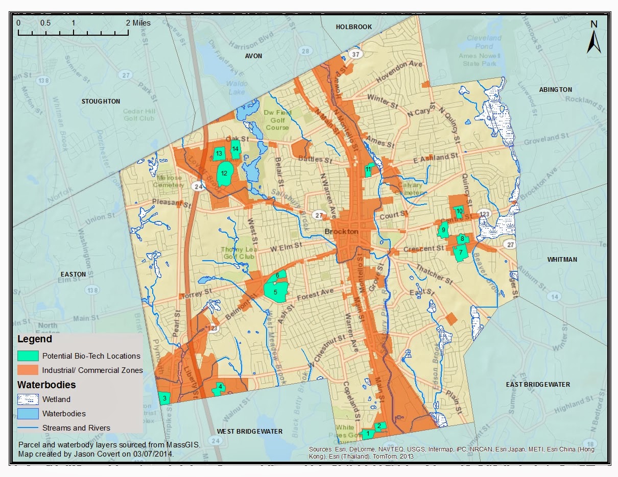
Maps can be beautiful things and therefore should be shared with the world. Esri ensures this is possible with ArcGIS Online. For our next class assignment in GIS 2, we were assigned a task to create a series of maps using ArcGIS Online that demonstrated what it was capable of. Most of the map-making was completed in the online interface, however it is possible to upload layers from those created in the ArcMap software for more advanced applications.

The first map embedded below shows the three newest Bridgewater State University buildings distinguished by color. The task was to create a footprint of those buildings using the digitizing tools available in ArcGIS Online. The online program is simplistic in comparison to GIS software, but for the purposes of quickly creating content with the intent to share, it works very well. Feel free to explore my map in the application. If you click on each individual building there is a pop-up that contains information and a picture.


View Larger Map
Below is my digital resume, a spatial representation of where I have attended school and worked. Within the map embedded below are pop ups which provide information relating to each placemark as well as relevant dates. The creation of this map was completed entirely in ArcGIS online using the supplied tools. Of course, this being a resume, it is in my best interest to display it in a professional manner. For that, I created a web application using ArcGIS Online.

Click the following link for my Resume Web Application


View Larger Map
One of the most important skills for a geographer is to manage geographic coordinates and have the ability to show them on a map. Fortunately, ArcGIS Online has an option to do just that. For this task, we were assigned to take the Latitude and Longitude from Angelina Jolie's tattoo in order to plot on a map the birthplaces of her children. The first step for me was to take the coordinates and convert them using an online calculator into decimal degrees. I inserted those coordinates in an .csv file and then simply dragged that file into ArcGIS Online. With a few minor adjustments to improve the visibility of the points, my map was complete.

The result can be viewed with this link: Jolie Tattoo Example


View Larger Map
Nowadays cell phones and cameras are often built with GPS capability allowing for easy geocoding of photographs. When a photo is geocoded it contains geographic coordinates in its properties that allows the photographer or viewer to place it on a map exactly where and in what direction it was taken. I find this feature especially useful when travelling and hiking because sometimes the locations where the photo was taken has few if any landmarks. It is also a fun way to track where you have been. Below is a map in which I have compiled many of the skills I learned in ArcGIS Online to make a shareable map. It features five geocoded photos that I took on Cape Cod and Nantucket. In this exercise, I refined all aspects of the map including full details, informative pop-ups, and coloring according to the direction I took the picture. The information in the pop-up windows were uploaded to the map from a dataset I created in a .csv file.


View Larger Map

Monday, February 17, 2014

A Population Analysis

For the first week of class, we were asked to produce a map that displayed all the towns and cities of Massachusetts according to their populations on a 81/2 by 11 frame, in black in white, uploaded to the internet in PDF format. The following map is what I came up with using Esri's ArcMap GIS software and population data from MassGIS. This was my first real attempt to produce a professionally formatted map using the software so it required me to refine some of my techniques learned  in GIS 1. I am proud of the result for a first try but as with anything, I now see a little room for improvement.

I started by importing the Massachusetts town boundaries layer from MassGIS and used the population data included to color each town. My first challenge was figuring out a way to classify the populations in the legend in a way that would be logical and useful. The problem was made difficult by the outliers of the data which, due to the disproportionate numbers of towns with similar populations, made the map almost entirely one category. The default methods for data classification offered in ArcMap did not display the data well so I decided to create my own intervals in the legend. I set them up based on what I figured would represent the towns sizes well, (0-1000 representing small towns, 1001-10000 representing mid-size towns, etc). Looking back, the better option would have probably been to base the intervals on the criteria that is generally accepted in town classification. After managing the legend issue, all that was left  was some aesthetic touch-ups including a neat-line, shading, town border colors, and of course, a scale bar and north arrow.